A short introduction to MatPlotlib (2024)
Introduction
I’ve been dabbling in data visualization for a while, and the journey’s been nothing short of interesting. It’s one thing to crunch numbers and quite another to tell a story with those numbers in a way that’s easy to understand. That’s where Matplotlib comes in; it’s a library I lean on time and time again to turn my datasets into clean, communicative visuals. Whether I’m sprucing up a presentation or exploring a fresh set of data, Matplotlib, along with a few other Python pals like Pandas and seaborn, makes the process smooth and intuitive. Let’s step through how these tools come together to make data not just seen, but truly comprehended.
Introduction to Matplotlib and Its Importance in Data Visualization

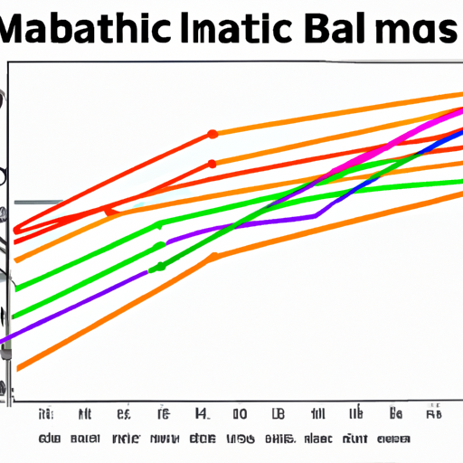
Matplotlib is the Swiss Army knife for data visualization in Python. From my personal experience, it has been the go-to library for plotting anything from simple line graphs to complex interactive visualizations.
This library’s importance in data visualization cannot be understated. For one, data is often complex and multifaceted, and numbers alone can be abstruse. Matplotlib bridges this gap by allowing you to create graphics that tell a story—making sense of trends, patterns, and correlations is paramount, and portraying this visually can be much more intuitive than presenting raw numbers.
Here’s a snippet to get a feel of how straightforward it is to plot a simple line graph:
import matplotlib.pyplot as plt

# Data
x = [0, 1, 2, 3, 4]
y = [0, 2, 4, 6, 8]

# Plot
plt.plot(x, y)

# Show plot
plt.show()
That’s it. Just a few lines of code and you have a visual representation of the data. Want to add titles and labels? No problem:
# Add a title
plt.title('Simple Line Plot')

# Add X and Y labels
plt.xlabel('X axis')
plt.ylabel('Y axis')

# Show plot
plt.show()
The library’s flexibility shows when you start customizing your visualizations to fit your needs. Tweak colors, add grid lines, or even plot multiple lines in the same figure—Matplotlib has you covered. For instance:
# Data for second line
x2 = [0, 1, 2, 3, 4]
y2 = [1, 3, 5, 7, 9]

# Plotting both lines
plt.plot(x, y, label='Line 1')
plt.plot(x2, y2, label='Line 2', linewidth=3, linestyle='--', marker='o', markersize=5, markeredgecolor='blue')

# Adding a legend
plt.legend()

# Using grid
plt.grid(True)

# Show plot
plt.show()
Every line of code you add serves a purpose and alters the output. This iterative process of adding elements and immediately seeing how they alter the visualization is what makes Matplotlib approachable for beginners like me when I first started.
The community supporting Matplotlib is immense. Resources range from official documentation to large repositories on GitHub. Moreover, its integration with other libraries is smooth, whether you’re using NumPy arrays or Pandas DataFrames; Matplotlib plays nicely with all. If you’re interested in a related topic, check out our short step-by-step introduction to NumPy (2024) which can enhance your data handling capabilities alongside Matplotlib.
Remember, visualizing data is not merely about creating graphics—it’s about understanding and communication. Using Matplotlib, you equip yourself with an effective tool to disseminate your findings.
And while I’m sure you’re eager to install Matplotlib and start plotting, that’ll be covered in the next sections. For now, know that having a grasp of Matplotlib’s basics and potential will set you on a path to crafting visual stories that make a difference.
Getting Started with Matplotlib Installation and Setup

Matplotlib, the go-to library for creating static, interactive, and animated visualizations in Python, is something I find myself installing on virtually every data wrangling project I work on. It’s not tricky to get started with, but there’s a sequence of steps I always follow to ensure I don’t hit any snags later down the line.
First things first, I make sure that I have Python installed on my system. If you’re on Linux or Mac, chances are you already have Python in your arsenal. Windows users often have to take the extra step of downloading and installing it. I usually grab it directly from Python.org to make sure I’m working with the latest stable release.
Once Python is ready to go, I use pip, Python’s package installer, to download and install Matplotlib. I open my command line interface and type:
pip install matplotlibWith this one line of code, pip does the heavy lifting and installs Matplotlib along with its dependencies. I occasionally run into a situation where I need to upgrade pip itself, and doing that is a breeze with:
pip install --upgrade pipNow, when using Jupyter notebooks for an interactive experience, I also install IPython and Jupyter via:
pip install ipython
pip install jupyter
This setup allows me to visualize the outputs of my code chunks directly below the code cell in the notebook. It’s excellent for iterative tweaking and getting immediate visual feedback.
For sanity’s sake, I always verify my installation. In the Python environment or a Jupyter notebook, I compile:
import matplotlib.pyplot as plt
plt.plot([1, 2, 3, 4])
plt.ylabel('some numbers')
plt.show()
If I see a simple line graph appear, I’m good to go! It’s like a ritualistic ‘hello world’ in data visualization for me.
I’ve found that Python environments could be fragile ecosystems of dependencies, so I strongly advocate for the use of virtual environments on any non-trivial project. Using venv module in Python 3, I create an isolated environment with:
python3 -m venv my_venvAnd then, I activate it:
# On Mac/Linux
source my_venv/bin/activate

# On Windows
my_venv\Scripts\activate
Activating the virtual environment changes the ‘scope’ of my terminal to the virtual environment. Any package I install now is confined to ‘my_venv’, preventing any version conflicts with packages installed globally or in other environments.
Don’t forget, if you’re working with data analysis or scientific computing, you might need NumPy along with Matplotlib. You can knock out both installations with:
pip install matplotlib numpyOne thing I can’t do without is the interactive plotting feature in Matplotlib. To enable it in an IPython shell, I use the magic command:
%matplotlib inlineThis line ensures that all my plots are rendered within the notebook, a feature I check is working right at the start to avoid breaking my flow later on as I crunch through datasets.
To wrap this setup, I have a starter template that I often reuse:
import matplotlib.pyplot as plt

def my_first_plot():
# Sample data
x = [1, 2, 3, 4]
y = [10, 20, 25, 30]

fig, ax = plt.subplots()
ax.plot(x, y, label='My Data')

ax.set_title('My First Plot')
ax.set_xlabel('X Axis')
ax.set_ylabel('Y Axis')
ax.legend()

plt.show()

my_first_plot()
That’s pretty much it for getting started with Matplotlib. Remember, practice is key, so I always recommend playing around with basic plots before moving on to more complex topics.
Basic Plotting with Matplotlib Essentials of Figures and Axes

Creating visual representations of data is crucial for analysis, and Matplotlib is a foundational library in Python that makes this possible. Understanding the concepts of figures and axes is essential when I’m plotting with Matplotlib. I like to think of a figure in Matplotlib as a container holding our plots, graphs or charts, and axes as the actual plots themselves – the canvas where data gets visualized.
Let’s get our hands dirty by crafting a basic line plot. We’ll first need to import Matplotlib’s pyplot module which I usually import as plt for convenience.
import matplotlib.pyplot as pltWith Matplotlib imported, I can create a figure object which is essentially a blank canvas.
fig = plt.figure()Now, this empty figure isn’t particularly useful until I add axes to it. Axes represent what we typically think of as a ‘plot’: where data points will be shown, where we’ll see ticks, labels, etc. Here’s how to add axes to the figure:
ax = fig.add_subplot(111) # 111 is a common shorthand that stands for 1x1 grid, first subplot.I now have a figure and a set of axes. It’s time to generate some data and plot it. For simplicity, let’s plot a simple linear relationship:
# Sample data
x = [0, 1, 2, 3, 4]
y = [0, 1, 4, 9, 16]

# Plotting on the axes
ax.plot(x, y)
To actually see the plot, I’ll call plt.show().
plt.show()After running this, a window should pop up showcasing a graph with our data points connected by lines. Pretty straightforward!
As I become more comfortable with the basics, I typically want to start customizing my plots for better clarity and presentation. A first step might be to add titles and labels:
ax.set_title('Simple Plot')
ax.set_xlabel('X Axis')
ax.set_ylabel('Y Axis')

# Don't forget to display the plot with plt.show() after making changes
plt.show()
Further customization can involve manipulating the line style, markers, colors, and adding multiple plots to the same axes. For instance, I might add a second data series to compare against:
# Second series data
x2 = [0, 1, 2, 3, 4]
y2 = [0, 0.5, 2, 4.5, 8]

# Plotting both series on the axes
ax.plot(x, y, label='Series 1')
ax.plot(x2, y2, label='Series 2', linestyle='--', marker='o', color='r')
ax.legend()

plt.show()
In this piece of code, I specified a dashed line and circular markers for the second series and also changed the line color to red for distinction. The legend() call adds a legend automatically, which helps differentiate data sets.
As I progress in Matplotlib, I’ll inevitably want to plot more than one set of axes within a figure. Doing so is straightforward with the subplots function:
# Creating two subplots
fig, (ax1, ax2) = plt.subplots(1, 2, figsize=(10, 5))

# Plot on first subplot
ax1.plot(x, y)
ax1.set_title('First Subplot')

# Plot on second subplot
ax2.plot(x2, y2, 'r--')  # shorthand for red dashed line
ax2.set_title('Second Subplot')

plt.show()
This creates a figure with two side-by-side plots, each with separate data and titles. Notice how the figsize argument changes the figure size.
As beginners, sticking to these fundamentals gives us a solid foundation for plotting with Matplotlib. We can construct a wide range of visualizations by just manipulating figures and axes. The possibilities are extensive as we start integrating other libraries or diving into the more advanced features Matplotlib offers. Just remember, like any skill, proficiency comes with practice and exploration. Keep tinkering with different plot types and customization options, and soon you’ll be able to visualize data in any way you imagine.
Advanced Customization and Plot Types in Matplotlib

When I first started customizing plots in Matplotlib, I felt a bit overwhelmed. There’s a wealth of options that can make your charts stand out and truly reflect the data you’re trying to present. I’m going to run you through some more advanced customization techniques, and introduce you to a variety of plot types that go beyond the basics.
Let’s start with something a bit more complex than your standard line or bar chart: a heatmap. Heatmaps are great for visualizing matrices and can be perfect for showing correlation between variables. Here’s how to create one from a numpy array.
import matplotlib.pyplot as plt
import numpy as np

# Generating some random data
data = np.random.rand(10, 10)

plt.imshow(data, cmap='hot', interpolation='nearest')
plt.colorbar()
plt.show()
Note how we use plt.imshow to display the data as an image, the cmap parameter to set the colormap to 'hot', which is a good choice for a heatmap, and the plt.colorbar() function to add a color scale.
To customize your plots, you can play around with styles. Matplotlib comes with a bunch of pre-configured styles that you can easily apply.
print(plt.style.available)This will print out a list of available styles. To use one, simply call plt.style.use(). Here’s an example with the ‘ggplot’ style that’s inspired by the R language’s ggplot2 library.
plt.style.use('ggplot')

x = range(1, 11)
y = [2 ** n for n in x]
plt.plot(x, y)
plt.title("Exponential Growth")
plt.xlabel("Exponent")
plt.ylabel("Value")
plt.show()
Now, let’s say you want to customize the look of your plots even further. Matplotlib’s object-oriented interface allows for a great deal of control. Suppose we’re plotting multiple lines and we want to control their properties in detail.
x1, y1 = range(0, 10), [10 * i for i in range(0, 10)]
x2, y2 = range(0, 10), [10 * i**2 for i in range(0, 10)]

fig, ax = plt.subplots()

line1, = ax.plot(x1, y1, label='Linear Growth')
line2, = ax.plot(x2, y2, label='Quadratic Growth')

# Customizing line styles
line1.set_dashes([2, 2, 10, 2])  # Format: line, space, line, space...
line1.set_color('purple')

line2.set_dashes([5, 1])  # Format: line, space...
line2.set_color('green')

ax.legend()
plt.show()
Another plot that’s particularly useful is the scatter plot with varying point sizes and colors. This can be quite illustrative if you’re looking to show three dimensions of data.
N = 50
x = np.random.rand(N)
y = np.random.rand(N)
colors = np.random.rand(N)
area = (30 * np.random.rand(N))**2  # 0 to 15 point sizes

plt.scatter(x, y, s=area, c=colors, alpha=0.5)
plt.show()
In the above code, we randomly generate data points and their corresponding sizes and colors. The parameter s is for size, while c is for color, and alpha represents the opacity level.
Matplotlib’s capabilities are robust, and once you’ve gotten the hang of it, the sky’s the limit as far as data visualization is concerned. Remember, the best way to learn is to play with the code yourself. So go ahead, grab some data and start plotting. You’ll be amazed at what you can create.
Integrating Matplotlib with Pandas and Other Libraries

Matplotlib, while powerful on its own, shines brightest when integrated with other Python libraries, especially Pandas. As a data enthusiast myself, I’ve come to appreciate the synergy of these tools for data analysis and visualization. Here’s how you can leverage Matplotlib with Pandas and other libraries to create insightful plots with ease.
Pandas make handling data a breeze. With its DataFrame structure, you can manipulate and prepare your data for plotting in Matplotlib. Let’s start with a basic example—I’m going to show you how to plot data from a Pandas DataFrame.
import matplotlib.pyplot as plt
import pandas as pd

# Sample data
data = {'Year': [2015, 2016, 2017, 2018, 2019],
'Sales': [200, 300, 350, 280, 320]}

df = pd.DataFrame(data)

# Plot using Matplotlib, directly using Pandas
df.plot(kind='line', x='Year', y='Sales')
plt.show()
In this code, df.plot() is a wrapper around Matplotlib’s plt.plot() that simplifies plotting with DataFrames.
Integrating with other libraries expands Matplotlib’s capabilities further. For instance, seaborn, a statistical data visualization library, works hand-in-hand with Matplotlib and Pandas. It provides a high-level interface for drawing attractive and informative statistical graphics.
import seaborn as sns

# Using seaborn to enhance the visual
sns.set_theme()
sns.lineplot(data=df, x='Year', y='Sales')
plt.show()
Notice how sns.set_theme() spruces up our plot with minimal effort? That’s seaborn working its magic on Matplotlib’s functionality.
Sometimes the interactivity is key. Let’s integrate Plotly, an interactive graphing library, with Matplotlib to make our plots more dynamic.
import plotly.express as px

fig = px.line(df, x='Year', y='Sales')
fig.show()
Plotly Express provides a simple interface to create a variety of interactive plots. This one lets users hover over points to see the data values.
For 3D plotting, we could turn to mpl_toolkits, an extension of Matplotlib. It’s a module that includes tools like mplot3d for adding a third dimension to our plots.
from mpl_toolkits.mplot3d import Axes3D

# Random 3D data
threedee = plt.figure().gca(projection='3d')
threedee.scatter(df['Year'], df['Sales'], df['Sales'])
plt.show()
This snippet shows how to produce a 3D scatter plot, adding a new depth to data visualization.
I also often find myself in need of annotating my plots for presentations. Matplotlib’s annotate() method is straightforward and highly customizable.
plt.plot(df['Year'], df['Sales'])

# Annotating the highest point
plt.annotate('Highest Sale', xy=(2017, 350), xytext=(2015, 320),
arrowprops=dict(facecolor='black', shrink=0.05))

plt.show()
As you make progress with Matplotlib and friends, remember that community forums and resources are goldmines of information. Stack Overflow, GitHub repositories, and the official Matplotlib gallery are full of examples to assist you further.
In summary, successfully integrating Matplotlib with Pandas, seaborn, Plotly, and mpl_toolkits means that you can not only plot simple graphs but also enhance, customize, and animate them with relative ease. For beginners, start with the basics and gradually incorporate other libraries to enrich your data visualization toolset. Keep experimenting, and you’ll be amazed at how versatile these tools are when you use them together.